Design Portfolio of Mike Syyap
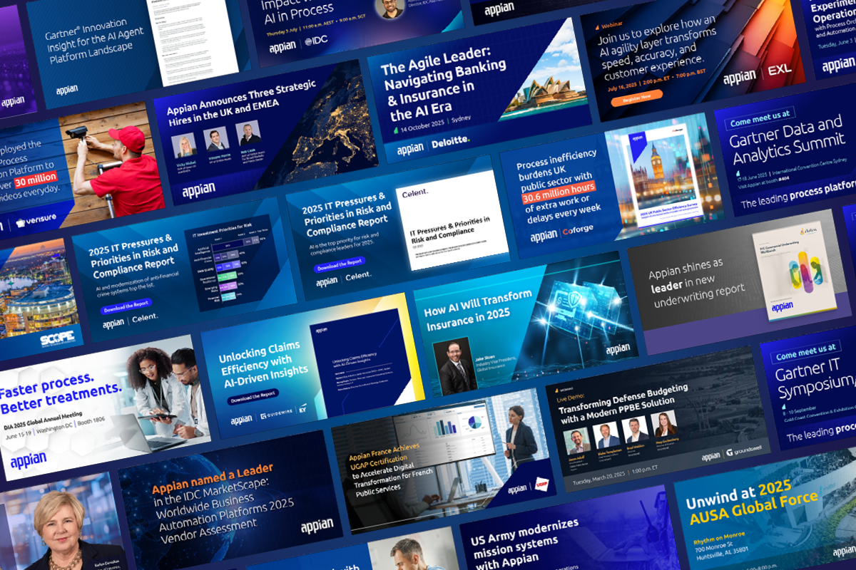
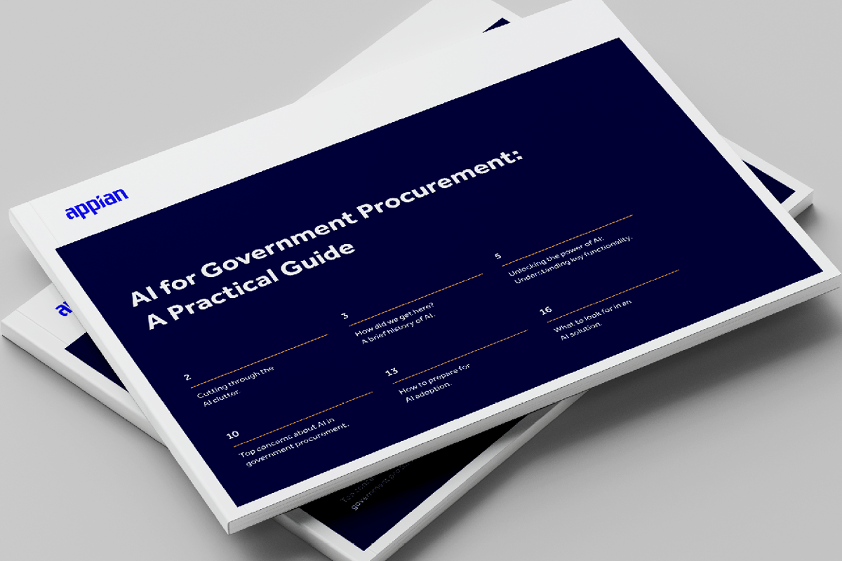
Various works over the course of my tenure at Appian. Ranging from booth designs, long form collateral, infographics, social media and digital to name a few.
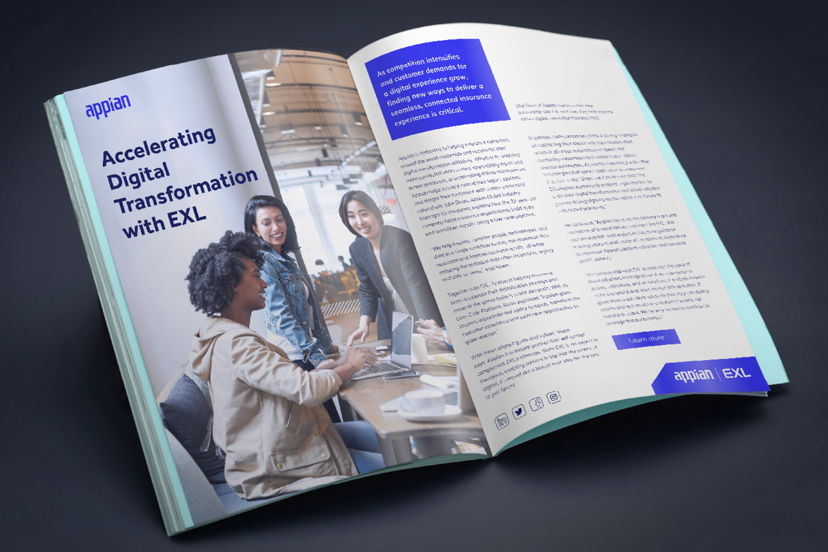
B2B design often feels like a "suit and tie" constraint—dry data and rigid personas. The challenge is injecting personality into every piece made. It’s break corporate monotony within the brand guidelines, and treating the end users like humans who crave eye-catching designs.
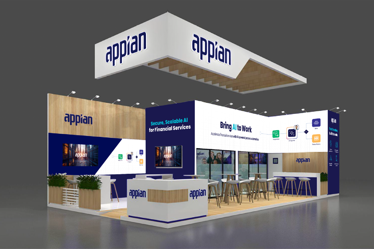
Work performed for Appian’s marquee events can be found here.
What will you transform?
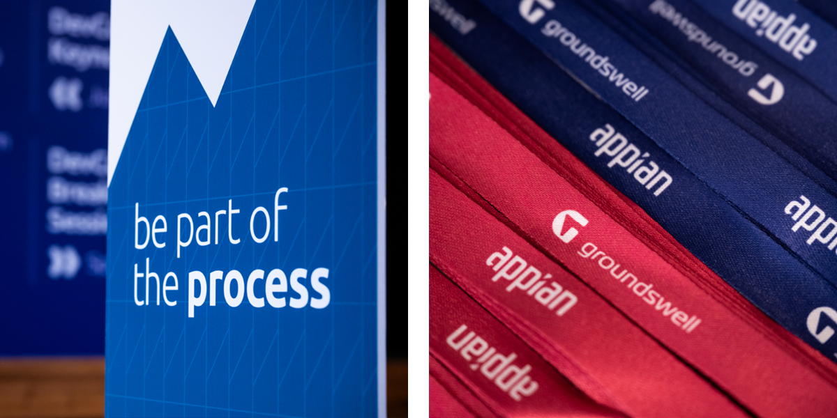
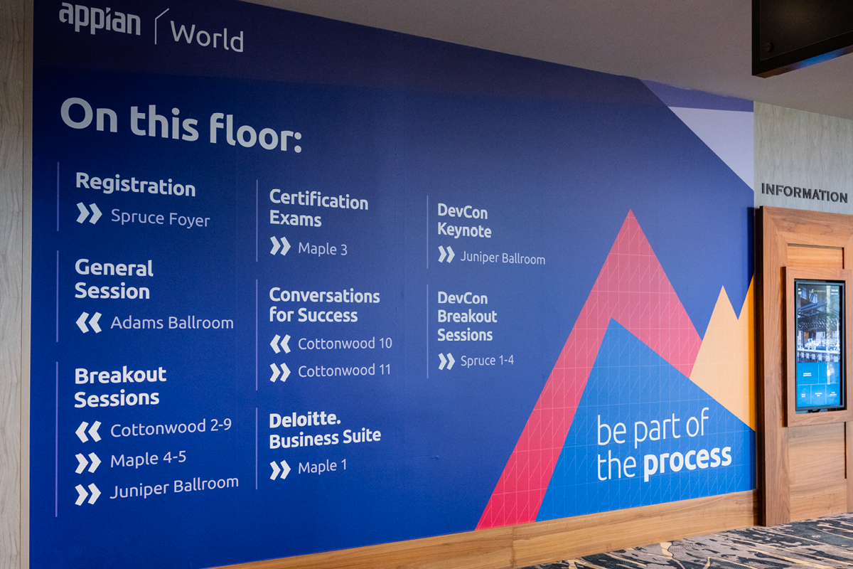
Be part of the process.
Appian holds annual events globally that highlight the company’s products and services, which change thematically year over year, extending beyond the brand guidelines while still honouring them meaningfully.
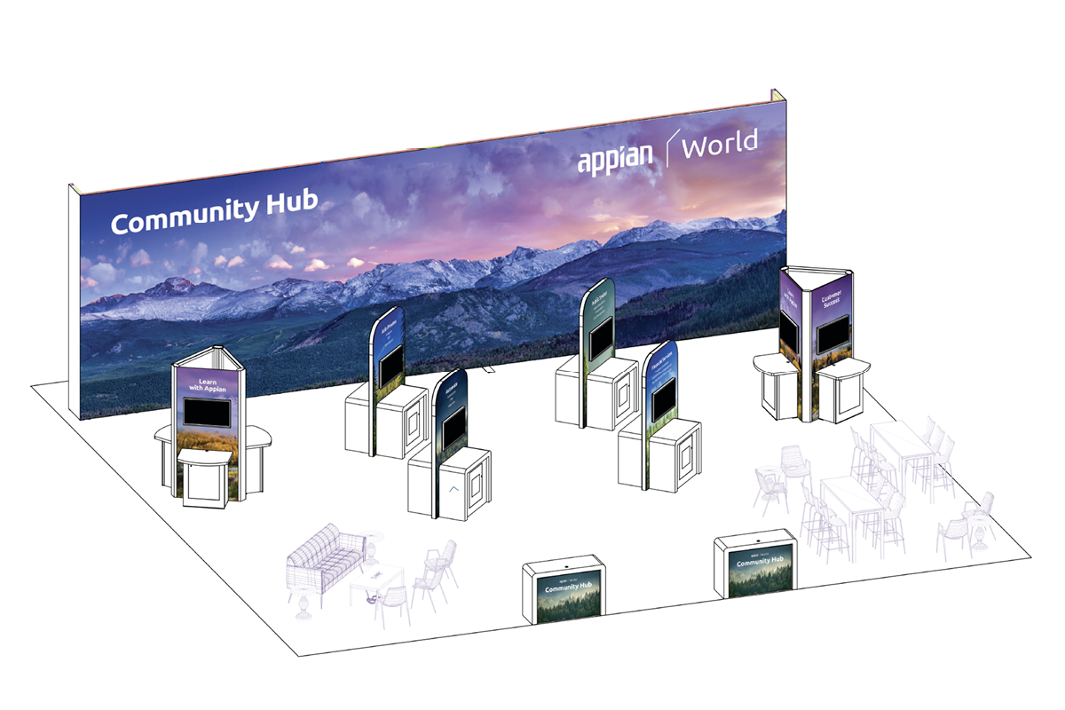
This section highlights the events where I took lead to develop, produce and execute the creative rollout across digital and print touchpoints.
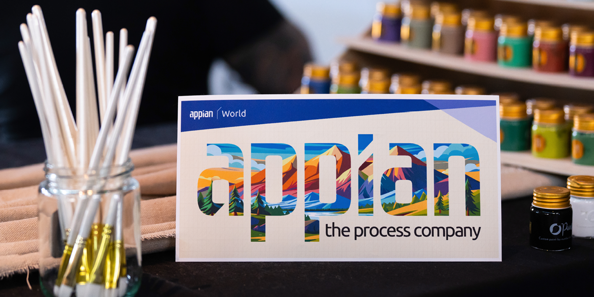
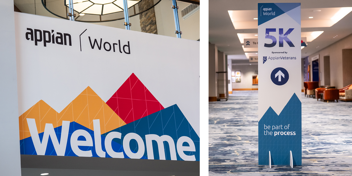
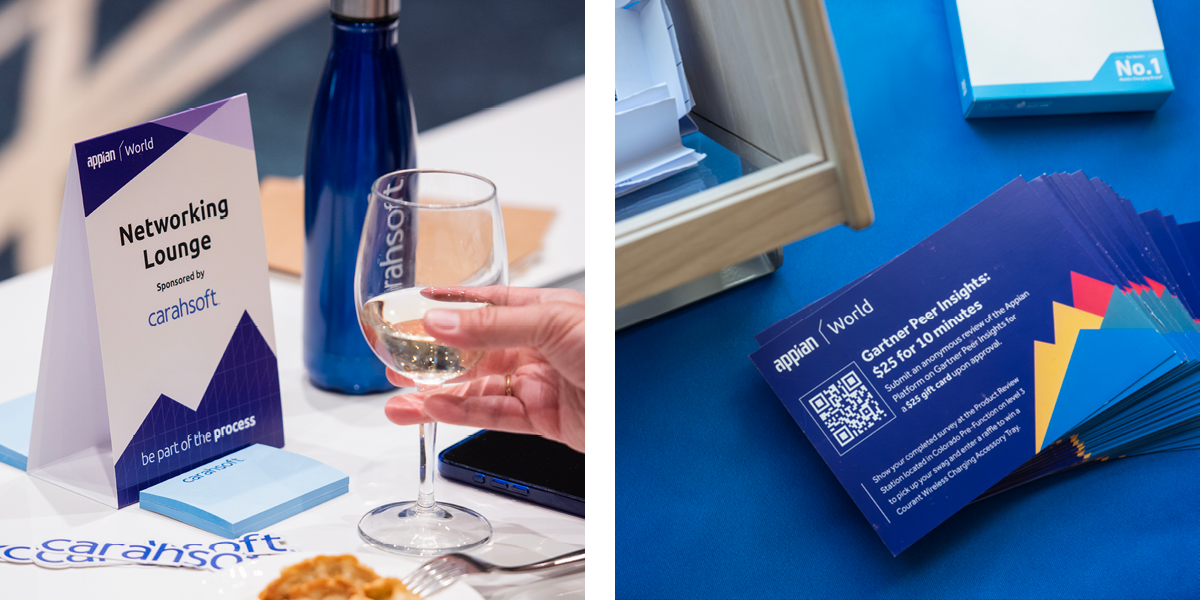
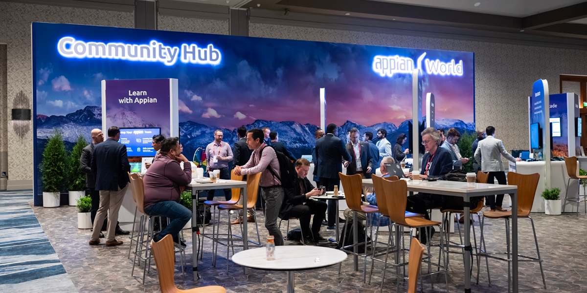
Appian World 2025
The Brief & Insight: Reaching new peaks both personally and professionally in the Colorado Rockies. Looking beyond the charts and data of our work to see the forest for the trees as the company hosts their first ever event in Denver, Colorado.
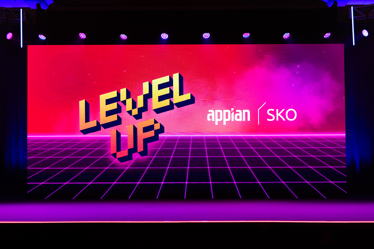
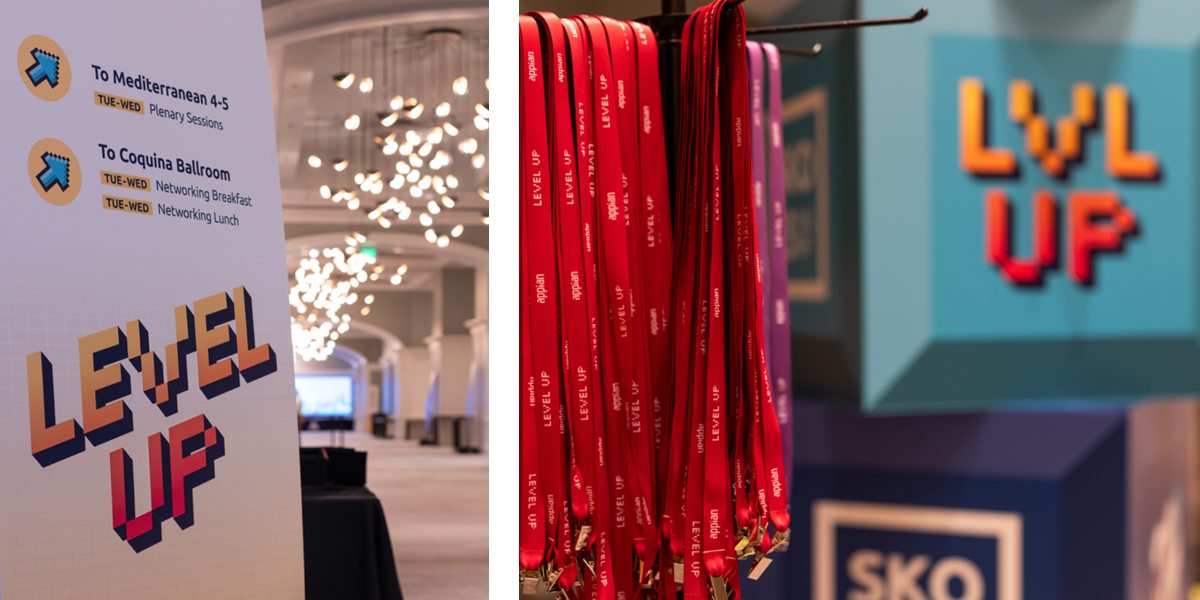
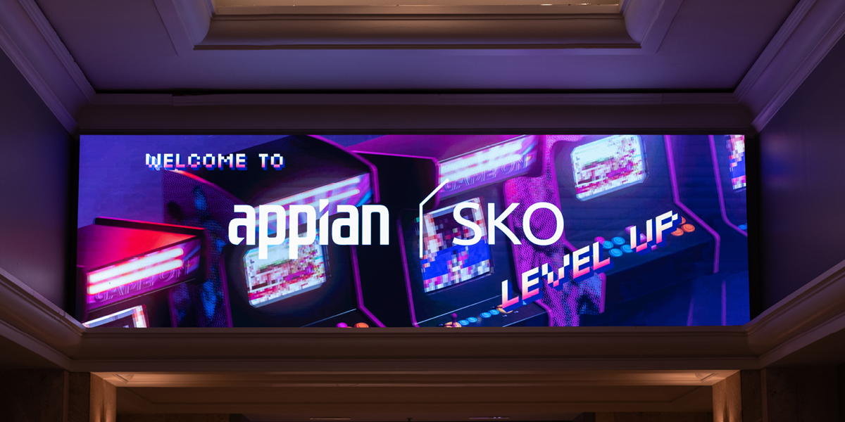
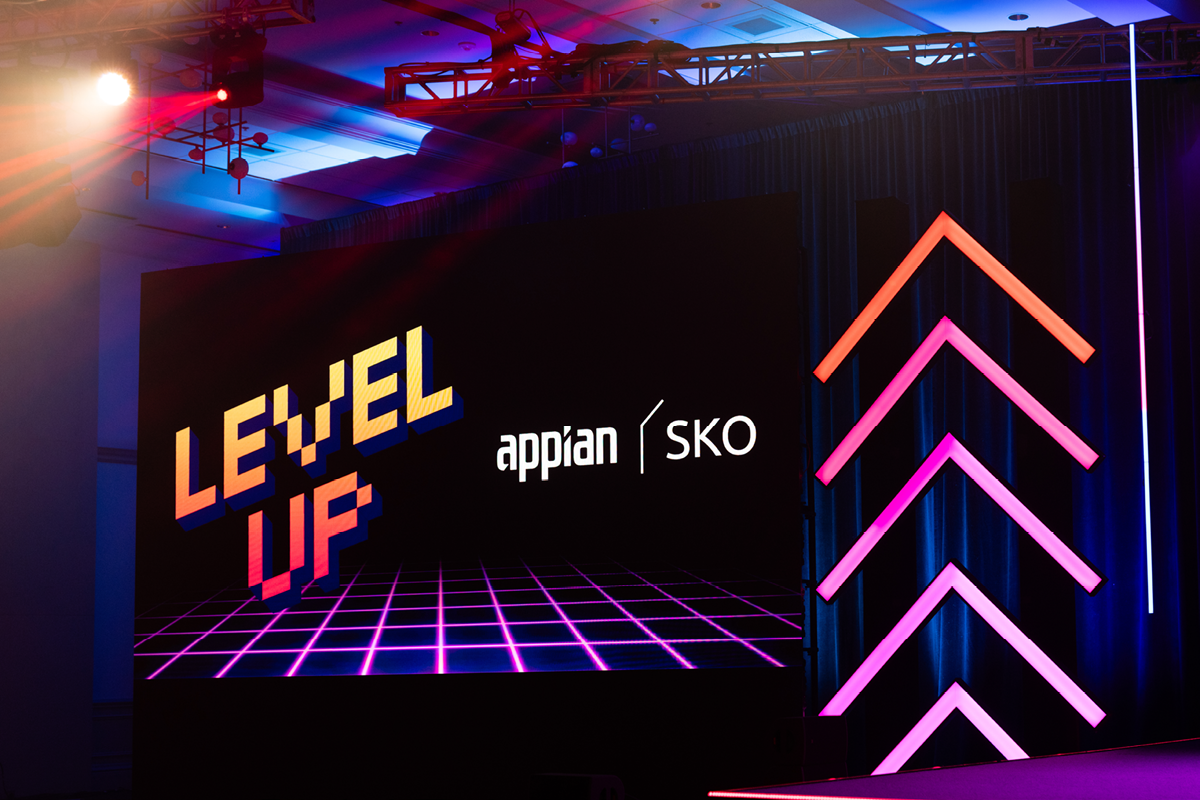
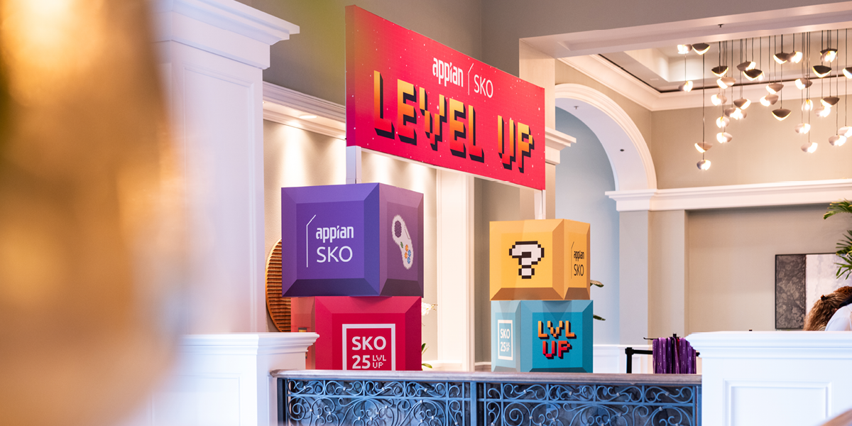
Sales Kick Off 2025
The Brief & Insight: Bringing the gaming theme of leveling up as the mantra for the Sales’ Team for FY’25. Find the nostalgia of the 80s and 90s video game culture and have with what we do at work.
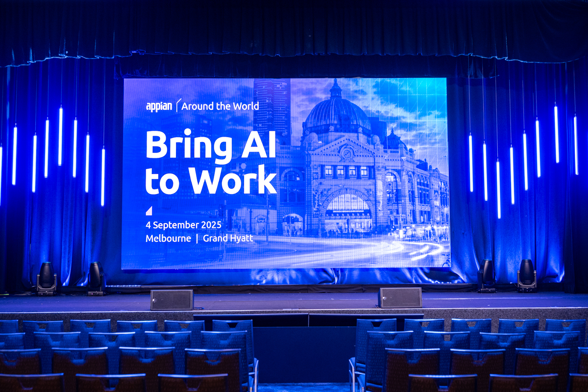
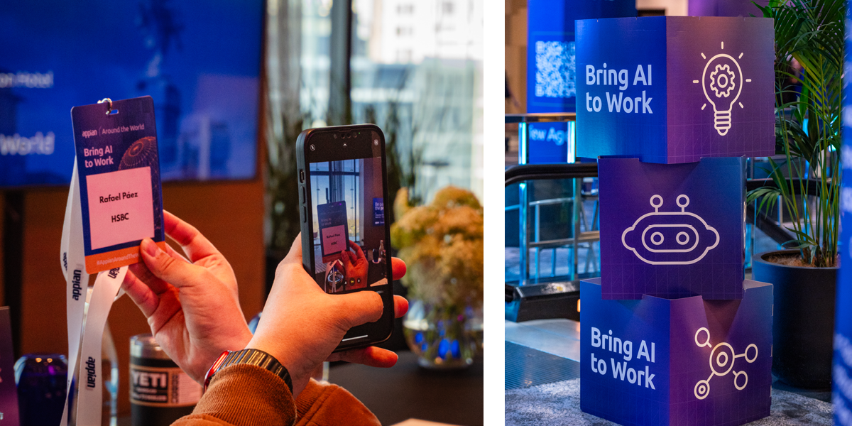
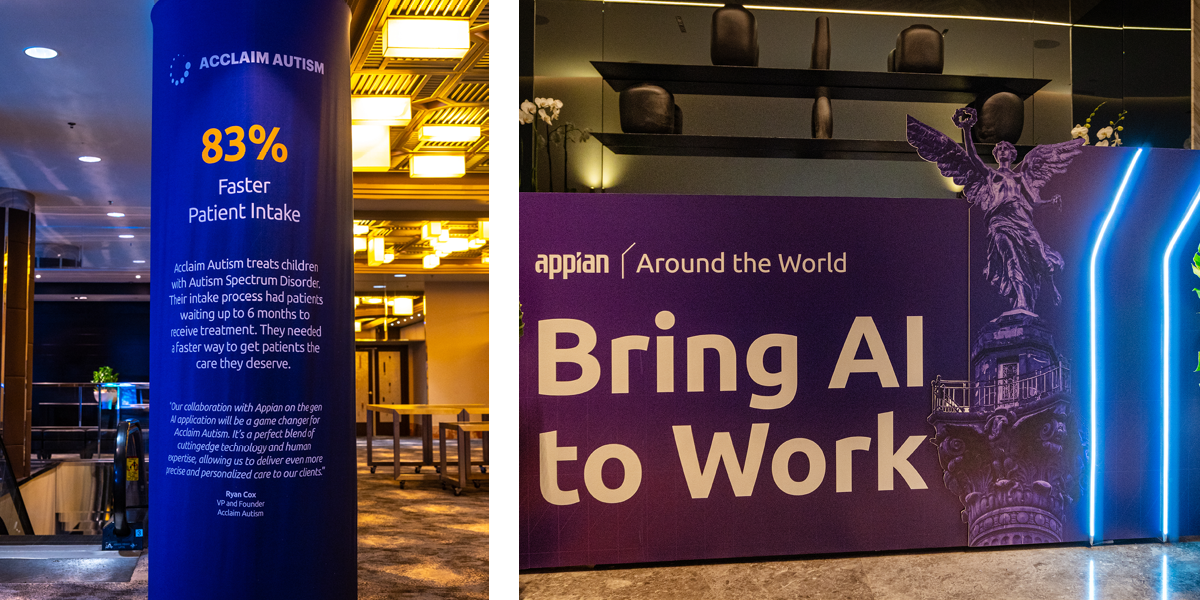
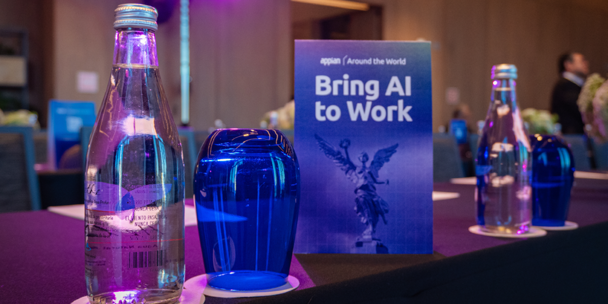
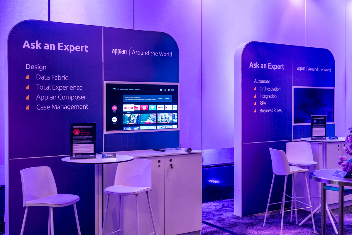
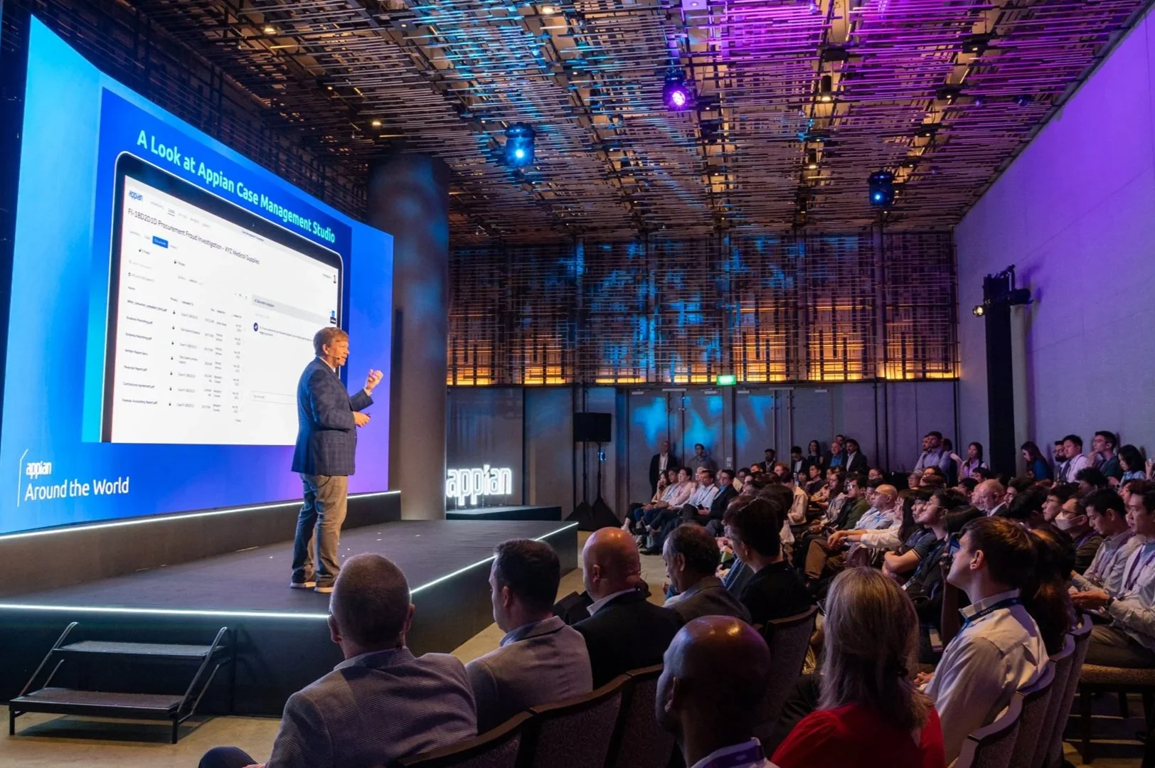
Appian Around the World: 2025
The Brief & Insight: Bringing Appian World to Around the World, bringing knowledge and expertise with local hospitality. Using pre-establish looks from the main event and translating it for each host city.
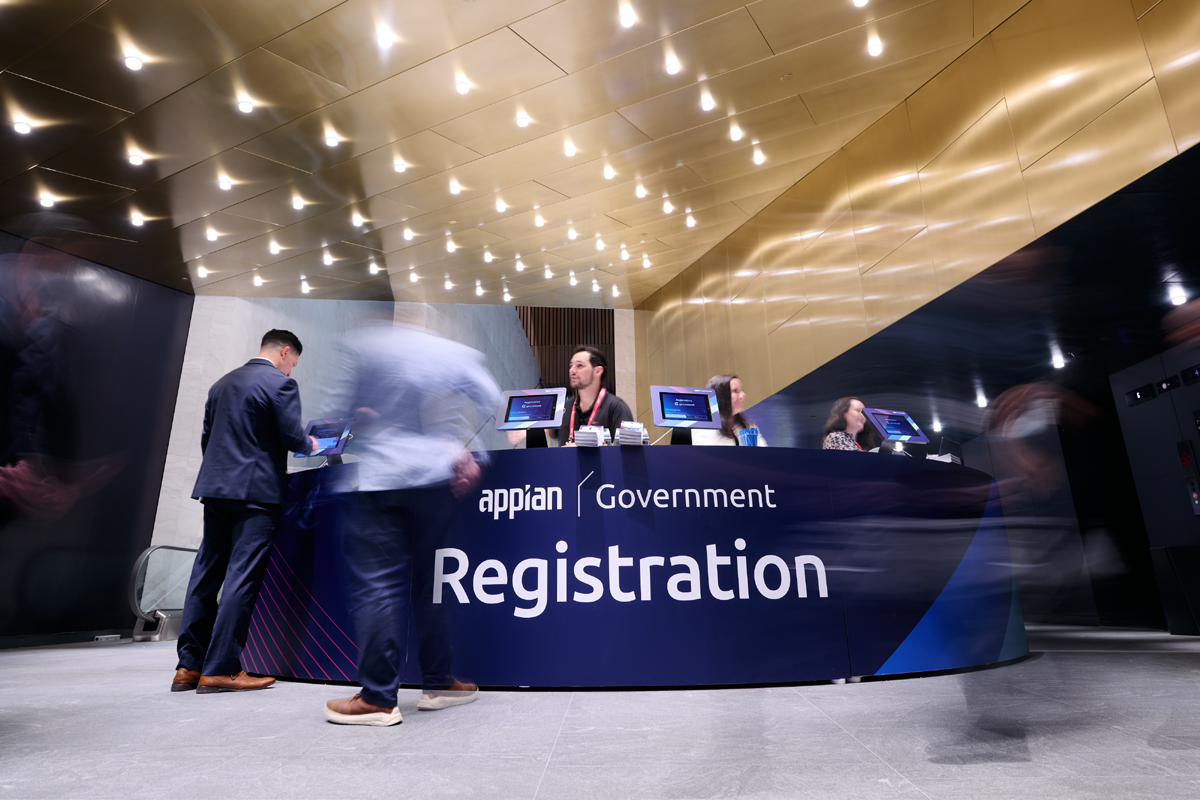
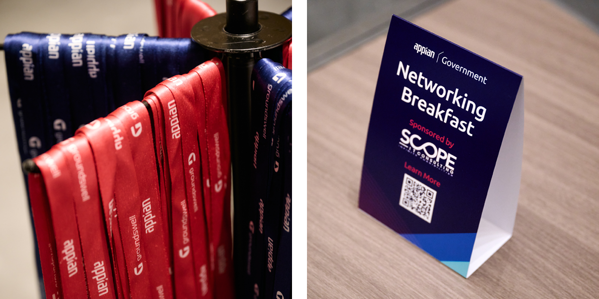
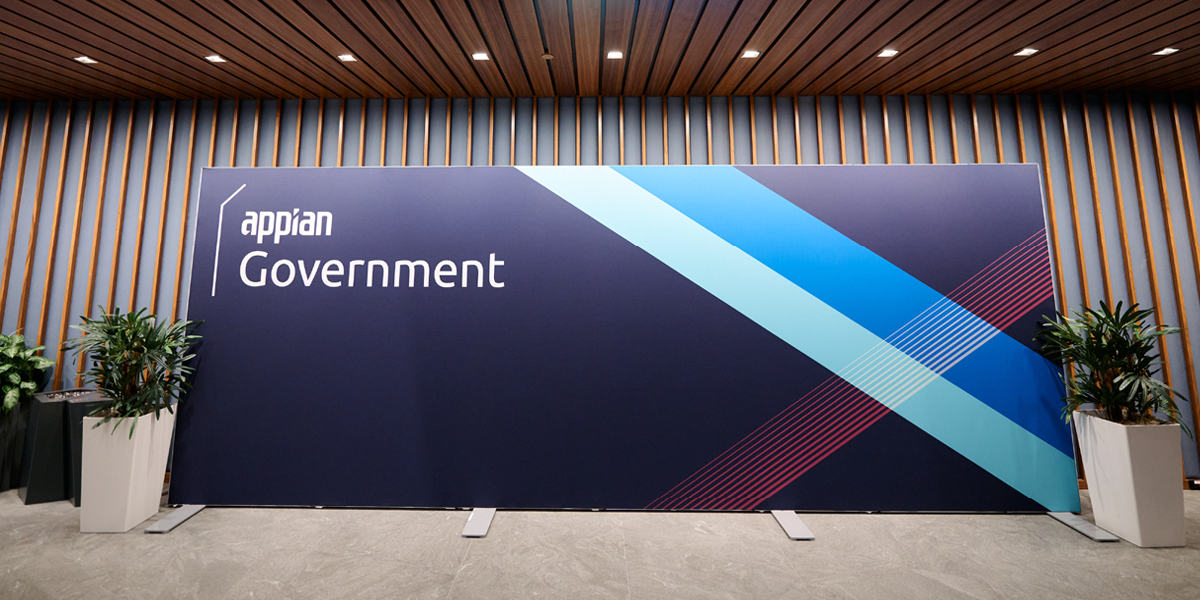
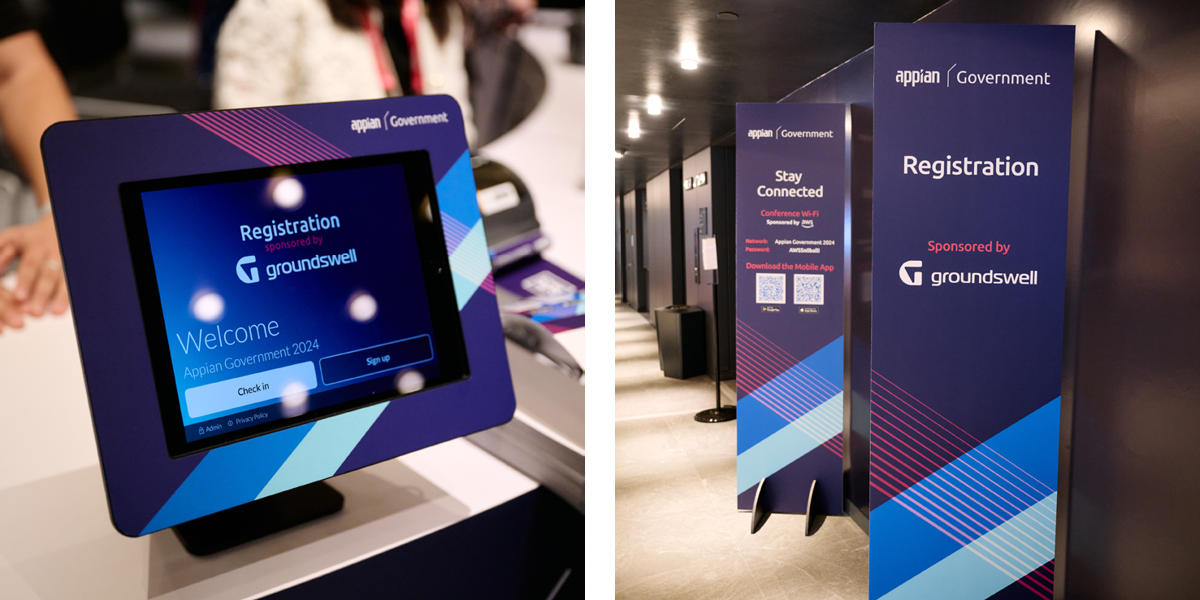
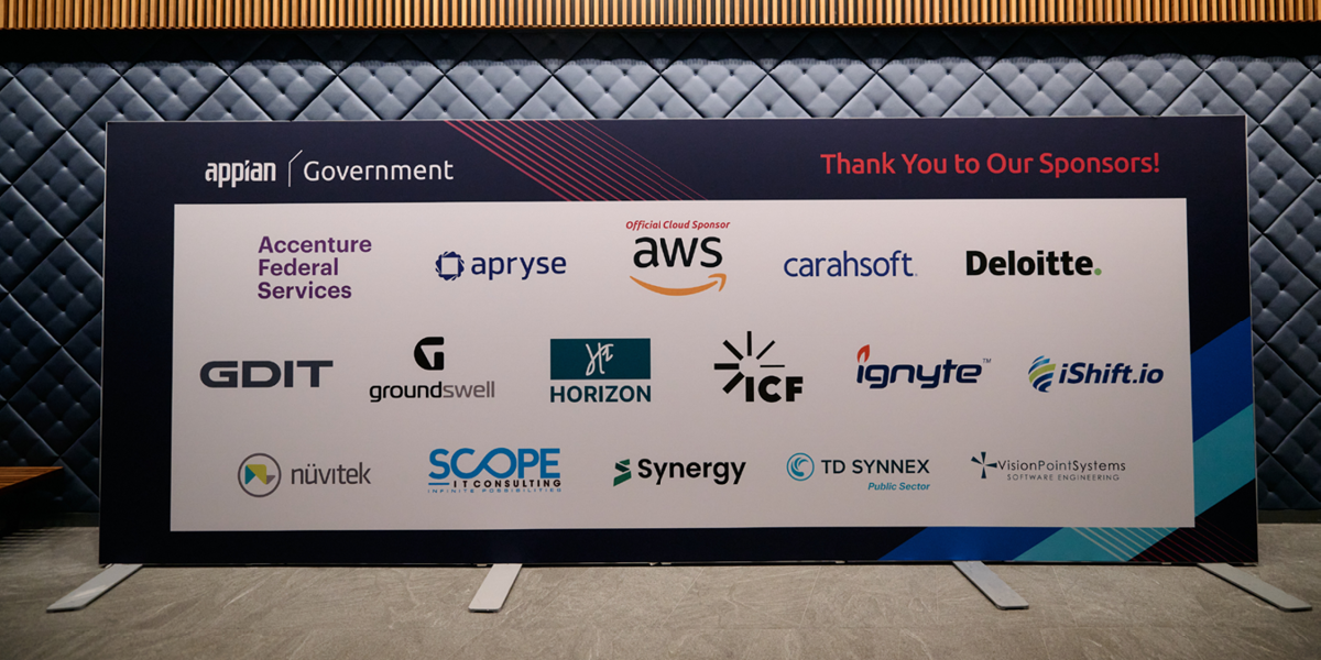
Appian Government 2024
The Brief & Insight: Something old, something new, something borrowed, something not quite blue. A non-devisive way to convey our overly blue brand to US government employees with a clean edge.
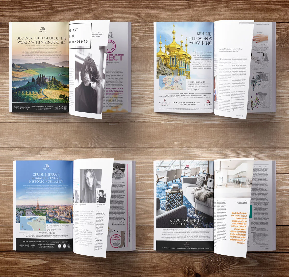
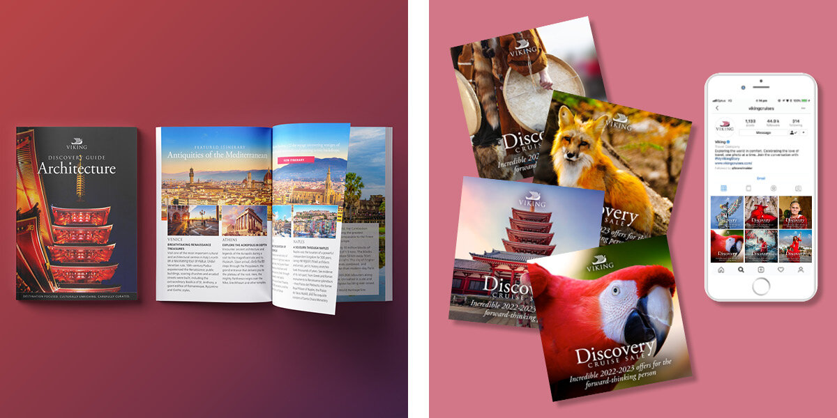
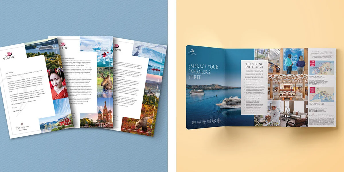
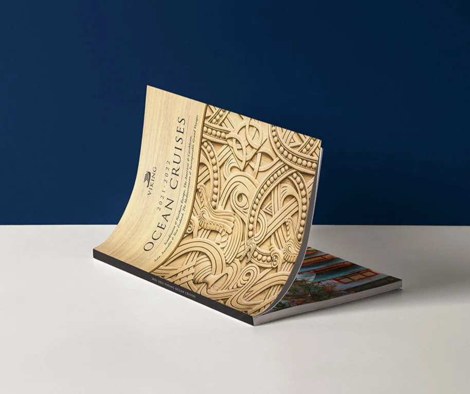
Various works over the course of my tenure at Viking Cruises. Ranging from brochure, catalogues, magazines, print ads, trade communications, social media and digital to name a few.
Working with a demographic that skews older presents unique challenges that rely on larger typefaces, eye catching looks that meet accessibility requirements. Other situations require designing more to traditional print mediums that can flexibly translate to digital channels for those adopting more to social media and aggregate websites and email newsletters.
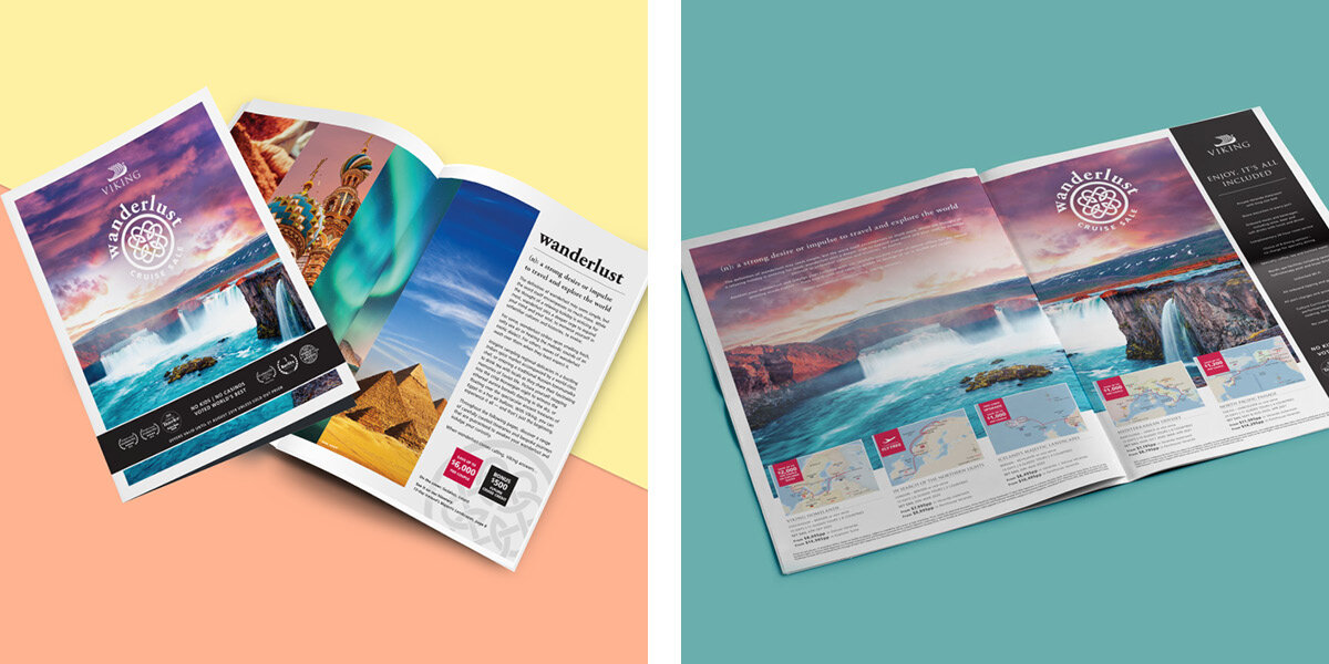
Quarterly sales campaign work can be found here.
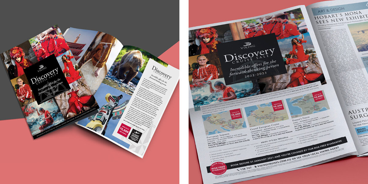
Viking Cruises holds quarterly campaigns highlighting product offerings to consumers which thematically holds a different look and feel from its brand guidelines while still following them. This offers a unique challenge staying within the confines of the brand look while trying to uniquely present to the consumer a limited time sales period.
This section highlights the campaigns where I oversaw the creative storytelling that each sale conveyed to the consumer during the highs and the lows of the cruising climate in the industry.
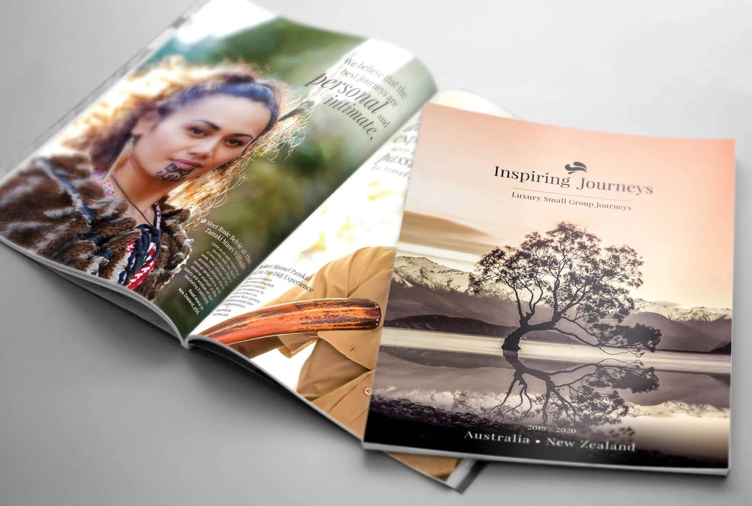
Every destination holds endless opportunities to create lasting memories through enriching and inspiring experiences.
Inspiring Journeys was in need of a creative transformation as a separate brand. The brand perception was that it was extension of the AAT Kings’ brand, suffering from no awareness by consumers and no understanding of value propositions by the industry.
Our team collaboration involved brainstorming, developing various compositions, gathering feedback from stakeholders and sourcing reference materials of the luxury space and competitors noting best design practices over a 4 month period.
Branding look and feel from 2014-2017.
Final brand logo after development process in keeping with the brief to up-market the look and feel while keeping the brand ‘marrque’.
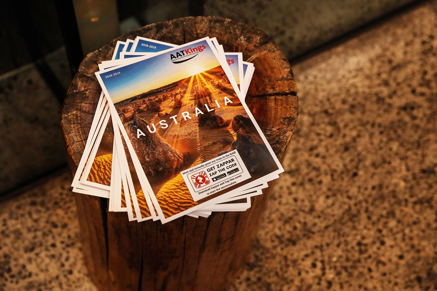
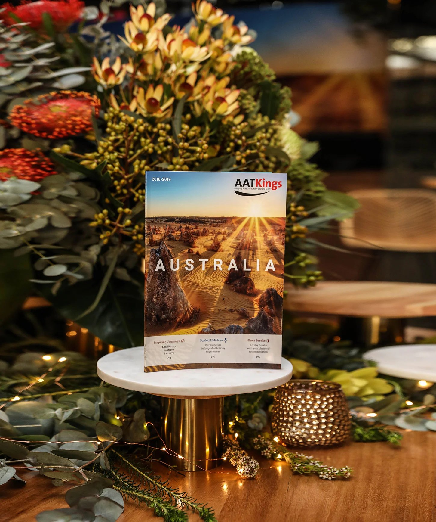
AAT Kings had been on an ongoing journey to properly define it’s brand look and feel as a complex portfolio of brands and products to contend with in a market filled with competitors. This section highlights a vertical slice of the growth and evolution of the brand and the collaborative contributions made to help solidify it’s place and identity in the industry.
Various works over the course of my tenure at Royal LePage. Ranging from posters, cards, postcards, booklets and videos to name a few.
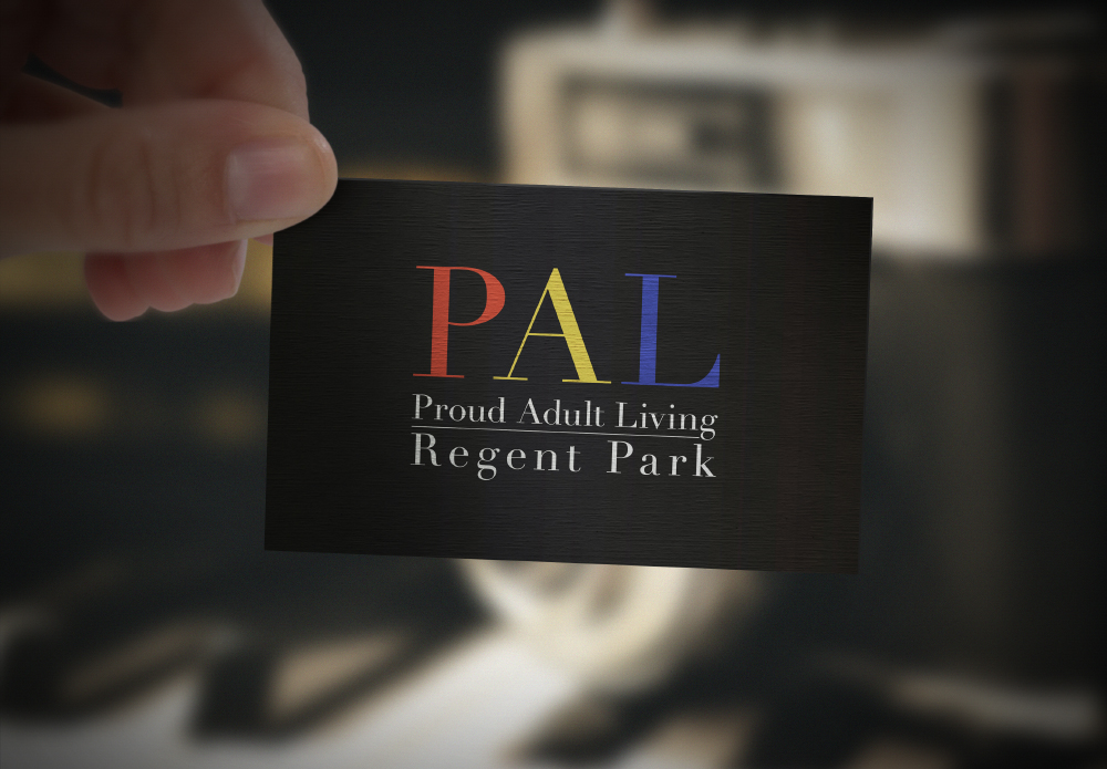
I consulted with many agents to execute personal brand identity refinements in all of their collateral touch-points, to help maximise the potential of generating customer acquisition.
Launch video presentation informing agents of the new office opening and a call to action to come join the company.
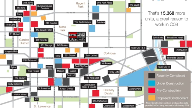
Quarterly video providing an insight look into the Toronto housing prices compared to last year.
Some of the things I like to delve in outside of work.